| Lace Flower |
About:
This happens to be the final layout of my blog. I'm no longer using it...Why not? Well, I found that I just kept forgetting to write in it. Pitas.com was the host, and don't get me wrong, I love the way they let you customize their online journals. So much better than anything else that's out there *cough cough*. My domain however was getting rather spread out on sites that weren't even located on animezenith.com ^^; I wanted to keep everything under one roof so that's why I moved it. Hopefully this will also remind me to write more entries, heh.
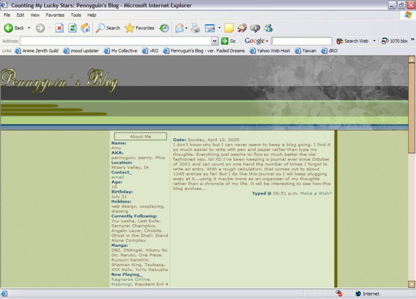
Ok, now about the journal itself... Inspiration came to me after seeing someone else's collective layout. Sadly, their site is no longer around. The colors are different than I'm used to working with. Muted tones, mostly khaki colors, abound. The color of the scrollbar however, ugh...not too happy with it. I have no idea why I didn't change it. When creating this layout, I copied and pasted code from another journal design and consequently forgot to change the scrollbar. Hehe, duh! Maybe I thought it worked at the time and just kept it in, but looking back on it now I can't help but wonder, "what was I thinking?"
I enjoy the fact that all the images are original. Right now I'm trying not to take images from other sites, but instead use ones I create on my own. You'll see this in some of my other layouts, particularly my third domain layout. Anyway, the background I think is easy to tell it's original, just a horizontal line pattern. The image in the top right corner however might not be easily recognizable. It actually started out as a digital image I took with my camera of a tree in my front yard. It was full of blossoms and just gorgeous...I couldn't help but save it! I played around with decreasing the colors and it came out looking like lace. The delicateness was really attractive so I kept it. Placing it on top of the striped background proved annoying. In the code, the image is in a table, so when you resize your browser it's always on the right-hand side. However, if your browser is not just the right width, the horizontal lines of the background will not line up properly ><+ Arg, I'm a perfectionist and that just threw off the whole thing...
I don't like the dimensions of the About Me box. They're too small for the amount of content I wanted to put in so I had to skimp on it. You're not able to see it in the above picture, but farther down the page I used some addresses that were wider than the width of the box... That's never a good thing. So I had to manually break it up in the code. I don't like doing that because I'm not sure how it will look on other browsers. Better to make a wide enough box that gives browsers enough elbowroom to render the content than have your page show up distorted.
Overall, this layout really doesn't do anything for me. A blog is supposed to be an expression of yourself, but this design doesn't convey anything special...and jinkies I want people to think I'm really SOMETHING! Haha, oh well, if I really liked this version I may have thought twice about moving my blog... Everything works out in the end so I'm happy.